“We do not believe any group of men adequate enough or wise enough to operate without scrutiny or without criticism. We know that the only way to avoid error is to detect it, that the only way to detect it is to be free to inquire. We know that in secrecy error undetected will flourish and subvert.” –J. Robert Oppenheimer
The area of present-day Fayetteville was historically inhabited by various SiouanNative American peoples, such as the Eno, Shakori, Waccamaw, Keyauwee, and Cape Fear people. They followed successive cultures of other indigenous peoples in the area for more than 12,000 years.
After the violent upheavals of the Yamasee War and Tuscarora Wars during the second decade of the 18th century, the North Carolina colony encouraged English settlement along the upper Cape Fear River, the only navigable waterway entirely within the colony. Two inland settlements, Cross Creek and Campbellton, were established by Scots from Campbeltown, Argyll and Bute, Scotland.
Merchants in Wilmington wanted a town on the Cape Fear River to secure trade with the frontier country. They were afraid people would use the Pee Dee River and transport their goods to Charleston, South Carolina. The merchants bought land from Newberry in Cross Creek. Campbellton became a place where poor whites and free blacks lived, and gained a reputation for lawlessness.[citation needed]
In 1783, Cross Creek and Campbellton united, and the new town was incorporated as Fayetteville in honor of Gilbert du Motier, Marquis de Lafayette, a French military hero who significantly aided the American forces during the war.[8] Fayetteville was the first city to be named in his honor in the United States.
Downtown Fayetteville was the site of a skirmish, as Confederate Lt. Gen. Wade Hampton and his men surprised a cavalry patrol, killing 11 Union soldiers and capturing a dozen on March 11, 1865.
Segregation, of course, was part of life there, and it is adjacent to Fort Bragg.
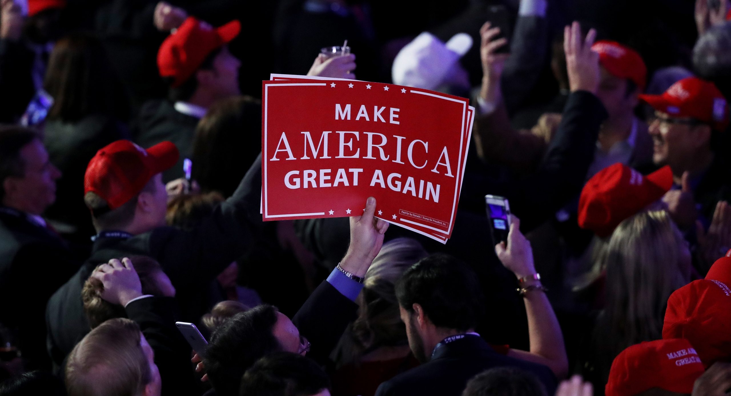
Our movement is about replacing a failed and corrupt political establishment with a new government controlled by you, the American People...Our campaign represents a true existential threat, like they’ve never seen before.
Then-Candidate Donald J. Trump
Lawyer Appeasement Section
OK now for the fine print.
This is the WQTH Daily Thread. You know the drill. There’s no Poltical correctness, but civility is a requirement. There are Important Guidelines, here, with an addendum on 20191110.
We have a new board – called The U Tree – where people can take each other to the woodshed without fear of censorship or moderation.
And remember Wheatie’s Rules:
1. No food fights 2. No running with scissors. 3. If you bring snacks, bring enough for everyone. 4. Zeroth rule of gun safety: Don’t let the government get your guns. 5. Rule one of gun safety: The gun is always loaded. 5a. If you actually want the gun to be loaded, like because you’re checking out a bump in the night, then it’s empty. 6. Rule two of gun safety: Never point the gun at anything you’re not willing to destroy. 7. Rule three: Keep your finger off the trigger until ready to fire. 8. Rule the fourth: Be sure of your target and what is behind it.
(Hmm a few extras seem to have crept in.)
The Mandatory Coin
This week something a little less eclectic.
President Theodore Roosevelt thought our coinage was ugly. In some cases that was true, but even the non-ugly items were still rather…boring. He wanted our coinage to resemble ancient Greek coinage, many of which are legitimate works of art.
At the time, 1907, coins of the same metal tended to simply repeat the same uninspiring designs, for instance the $2.5, $5, and $10 gold pieces had essentially the same thing on them, and had had them since 1839. The $20 gold was different, at least, but it had been introduced in 1850, and by then the mint had a new chief engraver, Christian Gobrecht having been replaced by James Longacre. (Longacre, by the way, had one big weakness. He couldn’t, to save his life, get lettering lined up properly.)
So here it was 1907 and Gobrecht’s design was still being used on most of the gold coinage after a run of over seventy years, and Longacre’s, not much newer, was still on the double eagle.
A similar situation obtained for the silver. The silver dollar (not actually being issued in 1907) was of one design (the Morgan design), but the other silver denominations, the dime, the quarter, and the half dollar, had all been designed by Charles Barber in 1892. They all bore the same thick-necked androgynous head of Liberty, with virtually no detail in the design–deliberately, so the coins wouldn’t turn ugly and lose detail as they wore. (I guess they couldn’t turn ugly if they were ugly in the first place!). These replaced the Liberty Seated series (another Gobrecht design but considerably degraded in execution), which I believe I profiled (some) last week.
Interestingly, the Barber series can actually look pretty darned nice…if the coin is pristine, in a high uncirculated grade.
OK I will fess up to owning one of these…not the same year, though. But this one in the picture has a piss poor strike with lots of detail on the eagle completely missing. It’s not worn–it’s just that they didn’t stamp (“strike”) it properly. The tails of the arrows are an indistinct blob on this coin, the wingtip on our upper left has a lot of missing detail too. Mine is not perfect, but shows a lot more detail. (And I will bet it grades lower in spite of this.)
I bring up the quality of the strike because it becomes key to the story.
Anyhow, I mentioned that Roosevelt found our coinage boring. He then embarked on what he called his “pet crime”–getting the coinage redesigned. He managed to see through changes to the gold coinage, and some of those new designs are renowned for their beauty (and I’ve talked about them previously). But the silver would have to wait–there was a law mandating 25 years between design changes, and it had, thus far, only been 15 years.
So action on the silver front would have to wait a while. But we did get, in 1909, the Lincoln cent. And in 1913 the Indian Head or buffalo nickel.
Finally towards the very end of 1916, new designs rolled out for the dime, quarter and half dollar. (Yes technically that’s slightly less than 25 years but they were so eager to make the change they counted inclusively to justify getting rid of the Barber stuff as quickly as possible…and: Oh by the way, Barber was still working for the mint while this was going on!) And these were different designs for the different denominations, for the first time (other than the dime having a wreath instead of an eagle on the reverse, since 1837).
But with greater artistry came another issue. The new coins did not strike very well. Collectors today know all three of these designs for habitually not striking up well.
The new dime immediately got the nickname “Mercury Dime.” Yes, that is still the head of Liberty on the coin, but it is wearing a cap with wings on it to symbolize freedom of thought, and that reminded people of depictions of the Roman god Mercury. Often enough the details of her hair don’t show very well.
That thing in the middle is a “fasces,” a symbol of power in ancient Rome. The magistracies (everything from aedile to consul) all had fasces as their badge of office, and numbers of people called lictors would accompany the office holder (who had to do his job in person), carrying these fasces in their arms.
Edit, Thanks to Wheatie who made me realize I had elided too much. The fasces are a Roman symbol of unity and strength. When carried by the lictors, they represented the power that had been invested in the magistrate that they (the lictors) were accompanying. Roman magistrates, at least during the Republic, had to do their jobs in person. They couldn’t delegate their powers. The US often used the fasces for the same reasons the Romans did, but Mussolini then perverted the meaning of the symbol and so it would eventually be dropped here.
Fasces, of course, is the root of the word “fascism,” which was Mussolini’s name for his movement designed to make Italy great again for the first time since the 400s. So once World War II ended we put Roosevelt (the other one) on the dime and replaced those fasces with a torch.
If you look at the fasces, in the center, there are two bands running horizontally across. On many “Mercury” dimes, those two bands don’t strike up properly and the line separating them will be weak or completely absent. And again, this is the way the coin is actually made in the first place, it’s not wear. Today, when a “Mercury” dime is graded, in addition to the actual grade you might see the designation FSB for “full split bands.” Depending on the year and mint (and you’ll notice this coin has a D next to the E in ONE, making it a Denver mint product), that FSB designation could be common, or rare, and if it is rare, it can make the coin much more valuable than the same grade without FSB.
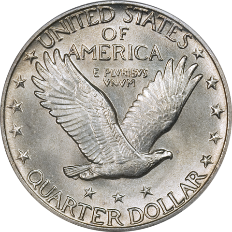
The Barber Quarter was replaced with the Standing Liberty Quarter, and even there, there were two major types of these quarters. Here is the first one:
(By the way if anyone can tell me how to get Wordpus to put pictures side by side, let me know.)
Notice one key, PG-13 detail about this coin…the exposed breast.
There’s a story that there was a huge public outcry about it and something Had To Be Done about it, but there’s no evidence of any such outcry in the newspapers of the time.
But they did change the design, midway through 1917.
Now Liberty is wearing chain mail and the shield has been redesigned. On the reverse the eagle has been raised a bit and three stars appear below it (and fewer stars appear near the edges, leaving the total number of stars at thirteen).
The mint hated this coin. It was nearly impossible to get to strike up. The overwhelming majority of the coins that came out looked poorly made. As it happens the 1917 coin is fairly sharply struck here, but there’s weakness on the 1924, especially on the date itself. The very next year the mint recessed the date because it was wearing off the coin too quickly. This 1924 is actually very well struck, for a Standing Liberty quarter. You can see most of the detail on Liberty’s head…and that’s the first place people look. Fully (or almost fully) detailed heads get the FH designation and it, too, can add huge money to the value of a coin.
But where you really need to look to evaluate the strike is at the shield emblem, and the rivets, on the shield.
The mint was glad to stop making these coins in 1930–and come out with the Washington quarter in 1932 (the 200th anniversary of his birth).
Finally, the half dollar. Here we have what is probably the most popular silver design in US coinage, though collecting Morgan dollars is more popular than collecting “Walkers” (for “Walking Liberty”).
Most people like to focus on the obverse–and our host occasionally posts a picture of one of these that has seen a lot of use, focusing on the motto.
But I think that is absolutely a kick ass eagle on the reverse.
This, too is a coin that is prone to striking issues. Liberty’s hand in the center of the coin is usually at least partially absent. You’ll notice on this one her fingers merge with the branch she’s carrying. People look for a complete thumb, but really those two fingers are the first thing to go.
I’ve yet to find a perfect one for my personal collection, though to be honest I haven’t really spent a ton of time looking.
But, as weak as this looks, in many cases, the entire center of Liberty is not struck at all. Instead of the fine details of her robe and the flag she’s draped in, there’s nothing but a blob of what looks like pitted metal running up and down through the center of the coin…the pitting being the way the silver looks before it’s struck, as well as after it isn’t struck. Truly sloppy workmanship!
There’s no special designation for this coin, but strike can make a huge difference in price nonetheless. People who collect Walkers know which dates are almost never fully struck; if you can score one of those, well, you’ll probably be eating Ramen for a few months afterwards to save money.
One interesting bit of trivia is that this is the only “mainstream” regular issue US coin to have a US flag on it.
This series run through 1947, to be replaced by the Franklin half dollar, with the Liberty Bell on the reverse (and people look for “Full Bell Lines” on that one).
But these are the coins that saw us through the Roaring 20s, and in two of the three cases, through the Depression and World War II. Today we have, I believe, much more boring stuff. (And the Jefferson nickel suffers from striking issues too, though the mint has finally figured out how to get all the steps to show up on Monticello, consistently.)
Standard Disclaimer: None of the coins shown are ones I own, though I’ll admit (in this case) to owning some examples of each of these designs. Prospective burglars should note that gold and silver aren’t the only heavy metals I collect, and that the other, unnamed heavy metal is kept a lot closer to me than the coins are.
Important Reminder
To conclude: My standard Public Service Announcement. We don’t want to forget this!!!
Remember Hong Kong!!!
https://youtube.com/watch?v=L3tnH4FGbd0%3F
I hope this guy isn’t rotting in the laogai somewhere!
中国是个混蛋 !!! Zhōngguò shì gè hùndàn !!! China is asshoe !!!