“We do not believe any group of men adequate enough or wise enough to operate without scrutiny or without criticism. We know that the only way to avoid error is to detect it, that the only way to detect it is to be free to inquire. We know that in secrecy error undetected will flourish and subvert.” –J. Robert Oppenheimer
This Stormwatch Monday Open Thread remains open – VERY OPEN – a place for everybody to post whatever they feel they would like to tell the White Hats, and the rest of the MAGA/KAG/KMAG world (with KMAG being a bit of both).
Our various sister sites, listed in the Blogroll in the sidebar
Our beloved country is under Occupation by hostile forces.
Daily outrage and epic phuckery abound.
We can give in to despair…or we can be defiant and fight back in any way that we can.
Joe Biden didn’t win.
And we will keep saying Joe Biden didn’t win until we get His Fraudulency out of our White House.
Wolfie’s Wheatie’s Word of the Week:
volens
adjective
In the state of mind where one voluntarily accepts a specific risk.
Willing.
In Latin: wishing, willing, welcome.
Primarily a legal term.
Part of another term, nolens volens (willing or unwilling; willy-nilly).
In law, volens is a state of mind, referring to voluntary acceptance of a specific risk. It is usually pleaded by way of defense, and often employs the legal Latin volenti non fit injuria. The term volens itself is often used in contradistinction to the terms sciens (meaning mere knowledge of the risk, without any voluntary assumption of it).
History of the term
The earliest known use of the adjective volens is in the 1870s. OED’s earliest evidence for volens is from 1872, in Law Journal . volens is a borrowing from Latin.
Exemplary legal usage
Sanjeet Singh Kaila vs Union Of India And Another [2nd May 2017]
In this case it was said that the risk may arise from a defect in a machine which the servant has engaged to work of such a nature that his personal danger and consequent injury must be produced by his own act, If he clearly foresaw the likelihood of such a result, and, not withstanding, continued to work, I think that, according to the authorities, he ought to be regarded asvolens. The case may be very different when there is no inherent peril in the work performed by the servant, and the risk to which he is exposed arises from a defect in the machine used in another department over which he has no control.(emphasis supplied)
MUSIC!
Start off with some super-classic country re-done by the next generation – twenty years ago.
I always liked Lee Ann, as part of “90’s country” which is currently held in some kind of classic esteem, but which seemed edgy and modern to us back then!
Let’s jump forward ten years to 2014, looking back again.
OK – we’re back to the present, with a recent recording of current country music. It’s poppy, but still very listenable.
Any classic rock fans out there? If so, check out this gigantic medley of Rush tropes to create one massive intro.
I was led to this song from last week’s bagpipe video. Weirdest fusion of genres (Punjabi and Scot) in forever. Then add rap music and stunning visuals. Enjoy!
THE STUFF
Yup. The left takes over everything, including Community Notes. “Note” how Milloy has to preemptively defend against abuse.
Milloy is using a very effective tactic to make people understand the most basic science – cause and effect. He’s showing that people are right to suspect there is no correlation between what the Climate Commies say affects climate, and reality.
We would expect to see direct connections, but we don’t. Why not? They will have answers, but the answers will ultimately fail to convince, as Occam’s Razor is repeatedly violated by hand-waving excuses and Rube Goldberg alibis, rather than pleasingly straightforward and multi-explanatory science.
Now let’s look at the COVID lies.
Two killer tweets that show COVID was a globo-commie Chinese/American production.
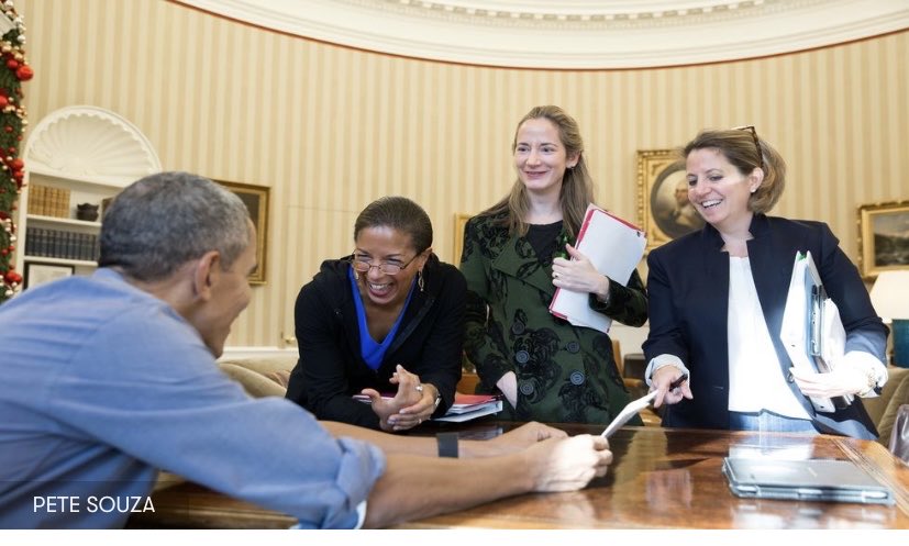
Note that Avril Haines is an Obama Girl – one of the Furies – or Harpies as I like to call them. The other two are Susan Rice and Lisa Monaco, also running the country. They’re part of the plot that runs Dementia Hitler as an avatar for Obola, who’s really behind what’s happening to America.
Thank God this is America. And keep thanking God if you want to keep it that way.
Tommy Robinson walks out of court and straight into a left wing journalist who he asks, “You watched yourself ask me questions, so what’s the difference between what you done and what I did? The judicial system has convicted me for who I am, not what I’ve done.”@TRobinsonNewErapic.twitter.com/R7IxE81xFZ
TL;DR – This post explains three graphs which all gave me “AHA” moments when I saw them. They all reveal lies in public science, which are used to manipulate humanity. Strategic and fundamental lies in climate science and planetary history are used to justify more tactical lies in energy and medicine. Together, these three graphs indict the sabotaged and weaponized public science which is being used against humanity.
All of this conforms to a concise and remarkably prescient warning by President (and former General) Dwight D. Eisenhower.
While there is much deep science in each graph, certain basic principles are easily seen without a technical background. Those ideas provide the “wait a second” thought needed for proper scientific skepticism.
If you want to get the “executive tour” and finish this in under 5 minutes, just read through anything that says TL;DR in bold, and the images next to the headline text. If you have 30 minutes, watch the videos next to TL;DR. If you have an hour or two, read everything.
If you read THIS paragraph, then consider the slow route. Or consider doing the TL;DR fast track first, and then coming back for the full ride.
Mood Music
Introduction
I wanted to keep this short, but I know that’s almost impossible. I’ve put off this post until I was ready, but I wasn’t ready until I heard this music (see above), while reading over an older post that aged well in a variety of ways.
Why would we mass treat a virus with a drug which forces the virus to mutate, when mutation is how the virus creates new variants that reinfect the vaccinated? Before I explain the title contradiction, let me start with an admission. Most of my life, I have been very friendly with the pharmaceutical industry. I …
The point I saw was that mass formation psychosis has been used at all levels of science, and the only way for us to fix science now is
MASS FORMATION AWARENESS.
Be part of it. NOW.
Q = MFA
(The equation is a bit of a joke – but you are welcome to elaborate it humorously, fellow nerds.)
I had thought that maybe I was putting off this post until the last post was done, but the next post was always the last one, and I knew that I would always find just one more post to do first.
Nope. Now is the time. The last “Wheatie” post is in the can, strengthening my soul, and in hearing this song that I used for it, while knowing that we are on the right path, I’m suddenly ready.
There is a certain beautiful sadness in knowing that I’ve remained silent about even ONE lie for far too long. And now, with THREE beautiful lies – three FURIES against mankind – it’s time to take them all on.
More Mood Music
(A song literally about mass formation psychosis.)
It’s The Jabs
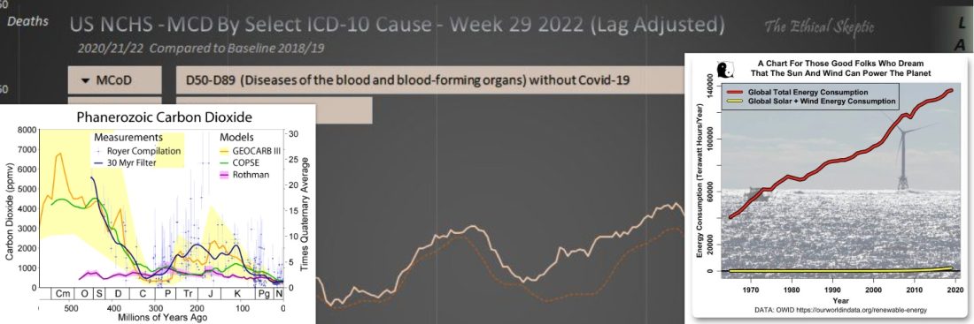
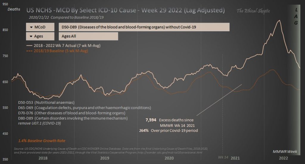
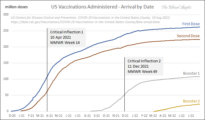
TL;DR – The Ethical Skeptic analyzed CDC data for causes of death in the US. By looking at deaths caused by blood and immune disorders, but not by COVID itself, vs. projections from pre-COVID data, two things show up – more “late” deaths related to COVID, and a MUCH BIGGER group of similar deaths that started precisely with the jabs.
You can see this in the graph as space between the two curves, widening first in Spring 2020 (twice), and much more in April 2021, coincident with the biggest deployment of the jabs.
I’m pretty sure Ethical Skeptic doesn’t believe in God, but that does nothing to keep me from saying “Thank God for Ethical Skeptic”. When Truth is an unyielding goal of individuals, they don’t need to agree on what Truth is, to create a world of good faith.
It was gil00 who brought me this tweet, wondering if it was important. I told her at the time that I needed to do a post on it, but that is just the beginning of its importance. Tradebait, Gail Combs, and the rest of the gang, also saw that this was a biggie.
The fact that it contains one of three graphs that “change everything”, should give you an idea of exactly how important I think it is.
ALL Americans need to understand this graph.
No – I take that back. All intelligent life within the sphere of influence of this planet and this moment need to understand this graph. THEY THE PEOPLE need to understand exactly who they’re dealing with.
Everything begins with the blood – and sequels from there… this is the other canary in the coal mine aside from rare cancers…
Before telling you WHY, let me assure you that there are MANY more graphs like this, which will all say roughly the same thing – IF one is honest enough to let the data talk. I choose this graph because it’s probably the clearest and simplest that I’ve seen so far – due in large part to its creator, The Ethical Skeptic, or “TES” as I will refer to him now.
We have talked about TES’s work before, since he emerged as one of the most skillful and impossible-to-censor critics of what might be called “Fauci science”. I may quibble with minor points on his more far-reaching hypotheses and theories, but I always find that his general and bigger principles “age spectacularly well”, and are best taken very seriously at the earliest possible moment.
Again, hence the need for this post.
Here is what I said originally – it was my “initial reaction”. You don’t have to follow it too closely, unless you find it all obvious. I’m going to explain this in detail.
By looking just at blood and immune disorders, and comparing mortality of 2018-2019 (pre-COVID) as a baseline (which was then extended by seasonal extrapolation into 2020, 2021 and 2022, with normal population increase meaning a slight increase in deaths), and then looking at 2018-2022 actual for all years, using the actual figures, but removing COVID, one can see the population reduction effect of the jabs, as the excess cardio and immune mortality, which just keeps increasing with time.
It’s clear as a bell in the data, when one compares to the “expected deaths based on the last two years of pre-COVID times”.
The striking thing is how STRONGLY the sum which includes 2020 and 2021 deviates away from the prior years, starting exactly with the jabs.
2020 includes TESTING of jabs. 2021 includes DEPLOYMENT of jabs. 2022 includes BOOSTING of jabs.
It’s a depop shot. And it works. All they would have had to do is dial up the dose just enough, while normalizing the deaths with the media, and it’s totally tunable to the rate of depop that one desires.
OK – so what does all that mean?
Let’s take it slower.
First of all, at any time, you can go to theethicalskeptic.com and check out his article on this topic, which does not YET have THIS particular graph (except in the comments), but which will likely have said graph in the next two parts of the article.
I also call your attention to this highlighted point made near the beginning of the article.
Nonetheless, by the end of 2021 it had become abundantly clear that US citizens were not just dying of Covid-19 to the excess, they were also now dying of something else, and at a rate which eventually became higher than that of Covid itself.
The Ethical Skeptic, Houston, We Have a Problem (Part 1 of 3)
If you just read that, where TES couches his words VERY carefully, and you know what he’s hinting at, then you know why I said this is one of the three big graphs you need to understand. He ain’t lyin’. My only quibble is that I suspect that his estimate of “decades” of damage to health policy may be conservative, and “centuries” is a horrifying possibility.
Are you ready to dig into the graph?
GOOD. Here we go.
Let’s start with some ACRONYMS.
NHCS = National Center for Health Statistics
MCD = MCoD = Multiple Cause of Death
UCoD = Underlying Cause of Death
ICD-10 = International Classification of Diseases, Tenth Revision
The basic graph is DEATHS going up on the left, and TIME going across from left to right, over a period of YEARS.
The DEATHS on the left are showing from 350 per week (at the bottom left) to 950 per week (at the top left). That means that we are not seeing the 0-350 region, which is featureless and below the portion of the graph that we can see. It’s a legitimate suppression – it’s not hiding anything except relative magnitudes of the changes to a SMALL extent, and it helps us see the differences in those changes better. It’s a magnifier – just remember that it’s there.
The title says that this is US-NCHS data for Multiple Cause of Death, meaning it’s looking at all causes of death listed on death certificates in the US and then databased by the National Center for Health Statistics, which is part of the CDC. This database is then searchable online.
The title also says that this data is for SELECTED cause-of-death codes listed in the ICD-10 system. The data runs up to week 29 of 2022, and is adjusted for the lag in reporting to CDC at the end (see right-hand side).
Let’s jump briefly to the topic of those codes.
Using the drop-down buttons you can see in the image, TES has chosen death codes 50-89, but has excluded COVID-19. Those codes are briefly described as “diseases of the blood and blood-forming organs” (but excluding COVID-19). TES has also selected ALL ages.
In the lower left you can see several descriptions of that different groups of the D-codes mean. Generally speaking, these are related to blood, blood-forming organs, and some immune problems. We will quote from TES himself about these later.
This does NOT include cardiac arrests, strokes, and certain other “stereotypical” clot-shot diseases, but it DOES include more “obscure” diseases that we can intuitively expect would be affected by both COVID and the CLOT SHOT. Thus, it serves as a kind of sensitive test for “something bad in the blood”.
A critical point for understanding is in the subtitle below the title.
2020/21/22 Compared to Baseline 2018/19
What this means is that what we are really doing OVERALL is looking at the 3 years of data “from and after Wuhan COVID”, 2020-2022, and comparing those numbers to “before Wuhan COVID”, 2018-2019. This explains why there are TWO curves on the graph. But in order to do this VALIDLY, we have to PROJECT the numbers from 2018-2019 FORWARD into the next three years, since the baseline would automatically increase on its own. Thus, we have TWO CURVES that run for all 5 years.
It helps to look at the red dashed curve first. This is listed as 2018-2019 Baseline 5 week moving average. Don’t worry about the “moving average” stuff. What this does is to take a bunch of scattered points and smooths them into closer points that can be used to draw a curve through them. It’s a neat trick to create the “best curve through scattered points”.
You can see that this is a bumpy “sawtooth” curve, higher in the winter, lower in the summer, and slowly rising over time. Typically, over time, this is what you see. Every year can be predicted largely from one or more prior years. You just take the past, find all the patterns you can, and project them all into the future.
There is a related red note in the lower left corner of the graph that says “1.4% baseline growth rate”. This is the annual growth in the baseline numbers from 2018-2019. The numbers vary rather strongly from month to month, but not much year from year, meaning that it’s easy to predict what they SHOULD look like in future years, such as 2020, 2021, and 2022. Each year will look pretty much like the last, months and weeks will go up and down, but day to day it will be 1.4% higher than the previous year, following the patterns of previous years.
This idea works remarkably well.
OK – so what is the pink solid line? THAT is the ACTUAL NUMBERS, for all five years, from week to week, using a 7-week moving average, and reporting it as the LAST week of the seven weeks. This is where we’re going to find any interesting phenomena.
The use of a DIFFERENT number of weeks for the multi-week moving average serves as a kind of sanity check in the region where both curves derive from the same ACTUAL data (2018-2019). The curves will not be much different, and the differences are just an artifact of the methodology, but if you see a big difference in that region of the same actual data in both curves, it’s probably meaningful, and probably something WRONG in your processing of the data.
Any minor differences you DO see in the region of actual data vs. itself (2018-2019), serve as a nice comparison of SCALE to any systematic differences you see in the 2020-2022 region, which is the region of ACTUAL DATA (pink solid) versus PROJECTED DATA (red dashed).
For example, if TES has a similar graph for some code like automobile accidents or choking on food, you can confidently predict that ACTUAL data for 2020-2022 should match the curve for PROJECTED DATA from 2018-2019 fairly closely – apart from any unexpected societal effects of COVID such as lockdowns, but those would then appear rationally in the data.
SO WHAT DO WE SEE?
TL;DR – the actual deaths begin to exceed the projected deaths in stages, with a lesser jump happening due to COVID itself, but a far bigger jump (over 2.5 times as big) happening after people began taking the jabs in a big way in April of 2021.
Looking at the two curves with the innocence of a child, we see them separating in stages. We see them separate a certain amount (call it 1X) during spring and early summer of 2020 (call this region 1), then separating about twice as much (2-3X) during summer, fall and winter of 2020, and early spring of 2021 (region 2). Then, in late spring of 2021, the separation grows suddenly and substantially (7-10X) (region 3), and it just keeps growing into 2022 (15X+).
This is NOT an accident. TES knew that the vaccines began being given in a big way around week 14 of 2021 (early mid-April), as shown by this graph.
TL;DR – this additional graph shows how the slope (derivative) of total jab doses given is used to see when most of the jabs were administered. This is near the beginning of dosing, and explains the sudden rapid widening between the two curves in the primary graph. It’s a “pandemic of vaccination” much like COVID itself.
Based on this date, TES looked for ICD codes which show a dramatic WIDENING at “Critical Inflection 1” – meaning when the jabs were introduced (what I called the beginning of region 3), VERSUS any prior widening in spring of 2020, when COVID-19 of the Wuhan strain was introduced (what I called the beginning of “region 1”).
Stated differently, TES is only counting things which appeared dramatically MORE for the jabs, than they did for COVID itself.
Basically, TES is being “too fair” to the jabs. We know that there are many causes of death by both COVID and the JABS, “because spike protein”, but if it’s not overwhelmingly obvious IN THE DATA that they’re significantly and primarily due to the jabs, he’s not counting them.
He’s letting a bunch of jab deaths “get away”, to make sure that he’s indicting only real jab deaths.
As a side-note, this is what Gregg Phillips did with True The Vote’s geospatial data, by only counting the most blatant and obviously organized mule data (10 drop boxes and 5 stash houses). It becomes almost impossible to criticize the science, when data is winnowed down to exclude even the most marginally debatable data.
Deny the unethical skeptics even a foothold, and they cannot even begin to raise an unethical argument.
Pretty BOSS LEVEL if you ask me.
Here is what TES has to say about the ICD codes that he used.
With regard to these select ICD-10 codes, I have endeavored to highlight only those which have exhibited a stark difference between their arrival patterns during the 2020 pandemic period, and that period after MMWR Week 14 2021. While there are indeed increases in deaths incumbent inside the other ICD-10 codes, those increases appeared to plausibly conform to their same arrival patterns for 2020 as well. In other words, they appeared to be heavily Covid-related in their dynamics, both before and after the Week 14 2021 inflection.
Of particular concern, are those deaths which relate to body-wide regulatory systems as opposed to specific organs or causes. In other words, cancer and lymphomas, heart, autonomous myocarditis/pericarditis/conductive disorders, injuries to the liver and kidneys, etc. These are not only the canaries in the coal mine in terms of pathology, but may serve to indicate as well that a pervasive systemic disruption is at play inside the average US citizen human physiology, especially over the last 71 weeks. These are the death groups which exhibit the most stark trend of increase post MMWR Week 14 2021.
There have nevertheless been some attempts to “take down” TES’s analysis, but after two of them were burnt to a crisp on Twitter, it’s pretty clear that these attacks were not “ethical skepticism”, but in fact beautiful examples of what has happened to science in the wake of politicization and corruption. One academic was even outed by a sharp Twitter user as a practiced shill for the Faucism narrative, referred to humorously as “a regular on the fact-check circuit”.
NOW, knowing what the graph means – that the cure turned out to be worse than the disease (something which Trump said could not happen, thus forcing a coup to maintain the plot) – it is really worth it to go back and read TES’s article, if you have not already.
It’s tough science, but even if you just “kinda get it”, it’s WORTH IT.
It is important to read the comments at the end, too. Not only does TES have links to his Twitter defenses, and the graph highlighted in this article appears – there is comment by somebody who did a rough calculation based on mRNA therapies that have failed human trials in the past. Based on his calculations…. well, let me just quote.
Great work. I did a small quick model using a Gaussian Distribution over 9 years to see what the numbers would be each year for “events” given 80% of the total population vaccinated had active ingredients and would develop events similar to past other mRNA failed trials. 7,887 deaths per week is about 179% above my model for 2022. If the past is indeed playing out here, this excess deaths per week will increase by a factor of 9 over the next year. Most adverse events in past similar trials did not take place until year three. By year six, 84% of the cohort was positive for adverse events.
TL;DR – It’s now very likely that these late jab deaths will increase dramatically during the next few years, based on mRNA therapy trial information which was available but seemingly ignored.
Watch this video if you have 3 minutes.
I would even go so far as to say that this highly censored video of an alleged mRNA trial participant from several years ago (see above), breaking his NDA and claiming serious cardiac problems affecting almost all of the people in his trial, may not be a fraud.
If that video is entirely true, then based on his numbers, my assessment is that his trial was very likely a secret depopulation trial flying under the false flag of a secret mRNA therapy trial. Which may then make COVID-19 and the jabs, the mother of all false flags.
In my opinion it is important to force the finding and recognition of the truth, so that we can begin saving the people who are not lucky.
Any effort to work toward #TeamHeadsOnPikes to prevent the next one of these incidents from happening, is a separate problem I leave for others. I’m a bit too good at forgiving.
TL;DR – There has been plenty of data telling us that the jabs are problematic, but now we are faced with very clear proof that CDC must easily see in their own data, yet pretends not to see. Combine these two memes.
The illogical arguments conceal real goals and tactics.
Buckle up. They know we know, and they have a plan for it.
Even More Mood Music
(Because you must FEAR CARBZILLA!)
https://youtu.be/BJHuX_jeSf4
Carbon Dioxide Is Life’s Friend and Savior
TL;DR – This graph shows terrestrial life’s remarkably high tolerance for carbon dioxide (which is basically recirculating plant life), but poor tolerance of meteoric impacts during times of low CO2 and preliminary glaciation. We are being severely gaslit, to see climate science backwards, and to operate from reflexive fears which prevent full, true and larger understanding.
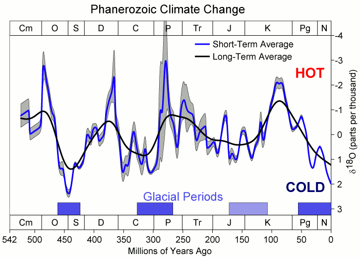
The graph you see above is NOT the first one that I saw, which blew my mind, but it’s very similar. The one I saw was basically the orange line, and may have been GEOCARB III or a comparable study. It had the exact same principle features, which told me the same things.
Apparently I missed the “mass formation psychosis” in climate science, and just happened to walk in with my “They Live” glasses on.
Let me state for the record that “I am neither a professional geologist nor an earth scientist, but I have loved the subjects my whole life, and I can read a graph.”
More crucially, I have always been an “allied science fan” of geology and earth science – in part because earth chemistry and earth biology happen on this wonderful planet called Earth. Follow either of these sciences back to the basics, and earth science matters.
Back to the graph.
It’s worth explaining the basics of the scale across the bottom, which is time.
We are at the very end of the graph – a slice so thin that our lives will not show up even under a magnifier. Bring out a microscope and see a tiny hair’s breadth under it. That’s us.
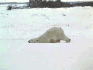
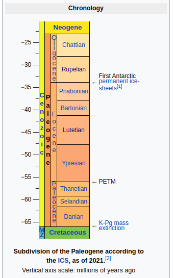
We are at the most recent edge of the Neogene – which is the N on the bottom of the graph. That N is 23 million years. The “preparatory ancestry” of anything strongly resembling our kind easily fits into that, as best as we can tell. You might call it “the age of man“, where man includes pre-men and barely men.
Probably even these guys and gals.
Humans trying to understand climate science.
Next to the left is the Paleogene, abbreviated Pg. This is the “age of mammals“. You will note that while it is much bigger than the Neogene, it is still a VERY SMALL fraction of the history of life on the planet.
Let’s blow it up a bit, using a DIFFERENT type of graph, which is more of a timeline. More recent is at the top.
The three most significant climate events of that time period are on the right. They all bear explanation.
First, Antarctica got its first RECENT permanent ice sheets only a bit over 50 million years ago, near the END of this prior period, and the start of the “age of man”. When you see NOVA specials about Antarctic dinosaurs, or read about fossil specimens from Antarctica, this is why you see them. Antarctica used to be WARM, and gradually cooled down.
Interestingly, Antarctica has never* (*not settled) strayed far from the South Pole. It has not wandered “north-south” as much as many other land masses.
LIFE has at most times covered the entire globe. Life had not RETREATED from the poles to the extent that is has now. Indeed, polar life may have assisted in recovery from some mass extinctions, where prompt damage occurred primarily at the middle latitudes due to normal circulation patterns.
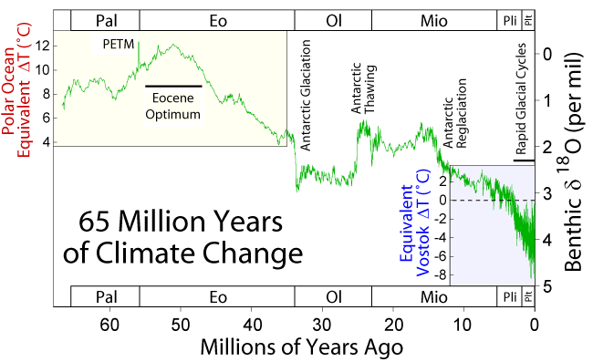
Next, look at the event called “PETM”, which stands for Paleocene–Eocene Thermal Maximum. It’s actually a SPIKE that looks like the thin spike in THIS graph.
This graph is looking at global temperatures (green curve) as determined from oxygen isotopes, VERSUS time, across the “age of mammals”. Recent is on the right.
WOW. Will you look at how much temperatures have fallen. And look at that crazy chaotic glaciation in the lower right, flirting repeatedly with the snowball Earth of the Permian Extinction (to be discussed in a bit).
I don’t know about y’all, but if I had to be concerned about something, it might be that.
TL;DR – it is impossible to look a graphs which show life bottoming hard against planetary freeze, in the big picture of carbon dioxide (recirculating plant life) bottoming hard in conjunction, and walk away with any true sympathy for worries about increasing CO2 and warming. CO2 in times of its relative absence is either not a problem, or a “good problem”. It appears to me that a cultivated science error has been used to create a social hysteria and then a mass formation psychosis.
In a sense, we are ALL the “polar bears of the dinosaurs”. Is that a good thing? I think it’s worth asking, even just theoretically, never implying the need to “do something” about it.
Anyway, that little SPIKE you see in the spiky curve to the left, is an actual example of a “climate change crisis”. It was probably due to sudden period of massive volcanic activity throwing a bunch of CO2 into the air, although that’s not “settled science”. If there was a weird “solar excursion”, or undersea heating of the oceans (see extremely useful “non-eruptive volcanism” proposals by TES for part of recent global warming), then it could have been something else. Whatever it was, it seems to have been sharp enough to have probably been a single thing.
Note also that Earth got to the same point some years later, anyway.
Don’t fear the seasons. They’re not the reaper.
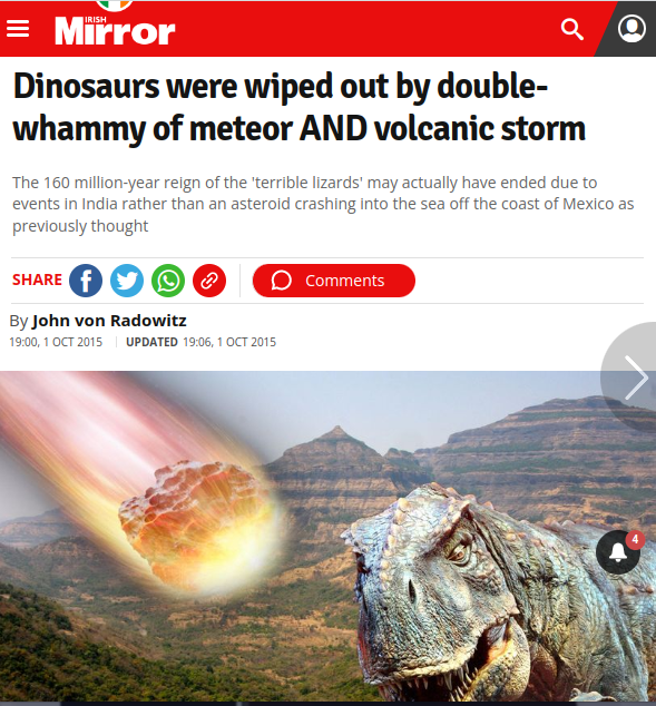
Lastly, we see in the timeline, at the beginning of the Paleogene, the K-Pg mass extinction, (also called, in its evidentiary form, the K-T boundary) which was almost certainly due to an asteroid impact, but possibly also reinforced by subsequent volcanism.
You may recall Steve’s post about this, but if you don’t, then take a quick detour and refresh your memory on the details.
4.567 billion years ago, our solar system began to “condense” from the nebula. Clumps of dust particles began to come together, part of a poorly-understood process that eventually led to the planets. The nebula had a potpourri of “stuff” in it. Mostly elements up to iron, with a heavy leavening of ones after iron, created in supernovas or even neutron star collisions. (Most gold is believed to have come out of neutron star collisions…next time you admire that gold coin or your wedding band…think about where that stuff has been! Any of it not from a collision got blasted out of a supernova at 70,000,000 miles per hour.)……
Steve explained that while most of paleontology favors the “impact theory”, there has been a long-standing volcanic theory of the extinction, and even a group who believes that BOTH theories are not only correct, but connected.
With my taste for “AND logic”, you can predict where I would most likely fall in that debate – in the “it’s both of them, and they’re connected” camp.
Does that sound sketchy? Maybe a little too much of a coincidence? Is Wolf going out on a limb here?
Notice that by mentioning that Steve had mentioned this “theory of both”, I used PEER INFLUENCE to change your minds. Now I will use MSM acceptance to further change your minds.
TL;DR – Theories about impacts leading to increased volcanism also implicated in extinctions, are quite appealing to me, personally, as a kind of “general volcanism” (impact + rebound), but the whole thing is NOT settled science by any means. Just remember what I always say about “AND logic”. It solves scientific divisions, too.
But wait – I want to make a point about the Fake News in action, spinning science to keep it divided.
Yes, you see the “AND” logic right in the title. And if you read the article, the whole point is that there is increasing evidence of a causal connection between the impact and the volcanism.
But notice the wording in the title versus the subtitle. The title tells you, but does not emphasize, that the conjoint, causatively connected, unified theory brings two scientific camps together, both being correct. Then the subtitle tries to shift things over to one of the explanations, and to minimize the role of the impact.
“The 160 million-year reign of the ‘terrible lizards’ may actually have ended due to events in India rather than an asteroid crashing into the sea off the coast of Mexico as previously thought“
“RATHER THAN”?
“Rather than” an asteroid the size of Mount Everest?
It’s very clear folks – THEY WANT YOU DIVIDED.
By now you know, it’s just what they do. DIVIDE AND CONQUER. Indeed, I tend to think it’s what they’re TRAINED to do.
The FAKE NEWS controls science FAR MORE than most scientists are willing to admit.
But let’s get back to our story of the unified theory of impact AND rebound volcanism.
The primary CLIMATIC effects of the asteroid impact are believed to have been blast heating, followed by an “impact winter”, followed by chaotic climate, possibly including a greenhouse due to vaporized CO2 and SO2, followed by the same thing from further classic volcanism. The whole planet was definitely MESSED UP.
TL;DR –
HOT (impact). COLD (darkness). HOT AGAIN (greenhouse).
Then repeat the latter two for post-impact volcanism.
A constant, unified pattern of impact extinctions, layered on the preexisting, livable climate, at a surprisingly wide range of levels of carbon dioxide.
So what was there before that?
THE DINOSAURS. That is “K”, the Cretaceous Period (in English).
You will notice that T (or Tr), J and K are the three big periods of the dinosaurs with which most of us are familiar – the Triassic, Jurassic, and Cretaceous.
Let’s look at our graph again.
Yes. This “age of dinosaurs” was a period of warm temperatures and high carbon dioxide. Both much higher than what we have now, but – bear with me – there was a lot of LIFE, too – am I not right?
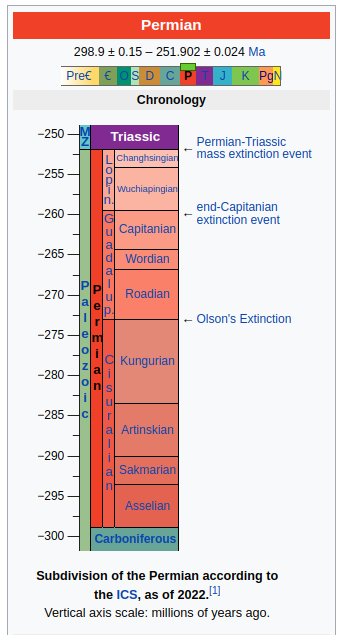
Well, what’s that stuff to the LEFT of the “age of dinosaurs” – around the end of “C” (Carboniferous) and the beginning of “P” (Permian – the “age of reptiles”)?
Why, it looks like low carbon dioxide, almost as low as we have now. In FACT, if you look even further back in time to the left – at the ages of sea organisms (Cm, O, S), fishes (D), and amphibians (C), what you’re basically seeing is a CRASH of carbon dioxide, ending in LOW CO2 around C and P.
And interesting that this slide had already resulted in massive glaciation of the planet, which existed at the beginning of the Permian.
Interesting that there were THREE BIG EXTINCTIONS along that slide, at O, D, and finally at P.
There is a LOT of debate about these extinctions, and particularly the near-total Permian (P) Extinction, also sometimes known as the P-T extinction event, because it occurred at the END of the Permian and the beginning of the Triassic.
Of course, global warming explanations of this event are favored by the single-minded corporate media, but IMO some of the best theories of the P-T extinction are actually based on an “iceball Earth” scenario, for which there is some interesting geological evidence.
The idea that an already glaciated Earth (Permian) was sent into deep freeze by an impact and response volcanism makes sense, and we would expect the extinctions to be more extensive than with the less glaciated or non-glaciated Cretaceous extinction of the dinosaurs, which happened to a generally warmer planet, thus sparing mammals and birds.
TL;DR – As the most significant extinctions have occurred at times of low CO2 and high glaciation, the main danger to life on Earth seems not to be global warming from CO2, which protects life from near-total extinctions. The main threat is solar blocking (see Bill Gates) and deep cooling, caused by meteoric impacts and rebound volcanism, which is more dangerous during times of low CO2 and high glaciation, like now or during the Permian Extinction.
In fact, I find the idea that we can use a single extinction mechanism repeatedly – a mechanism of “impact plus response volcanism, leading to plant death and further crises”, with the differences in outcome depending upon the size and location of the impact, plus the prior state of the climate, to be very satisfying – particularly in explaining why we find evidence for ALL of the various divided theories.
Furthermore, if response volcanism is a correct theory, then the general warmth and higher carbon dioxide of the “age of dinosaurs” may be explained by a truly massive impact being not only the cause of the P-T extinction, but also creating hundreds of millions of years of increased volcanism in its wake.
But all of that is debatable.
The big picture is this. Look at the graph again.
TL;DR – The Earth has supported life easily for eons because of MORE carbon dioxide, not less. There is no “climate emergency”, and certainly not one related to increasing carbon dioxide for ANY reason at this point. If anything, incipient normal solar cooling and periodic ice age glaciation are actual climate concerns for society. But that is another story for another time.
One More Bit of Mood Music
(Real World by Matchbox 20)
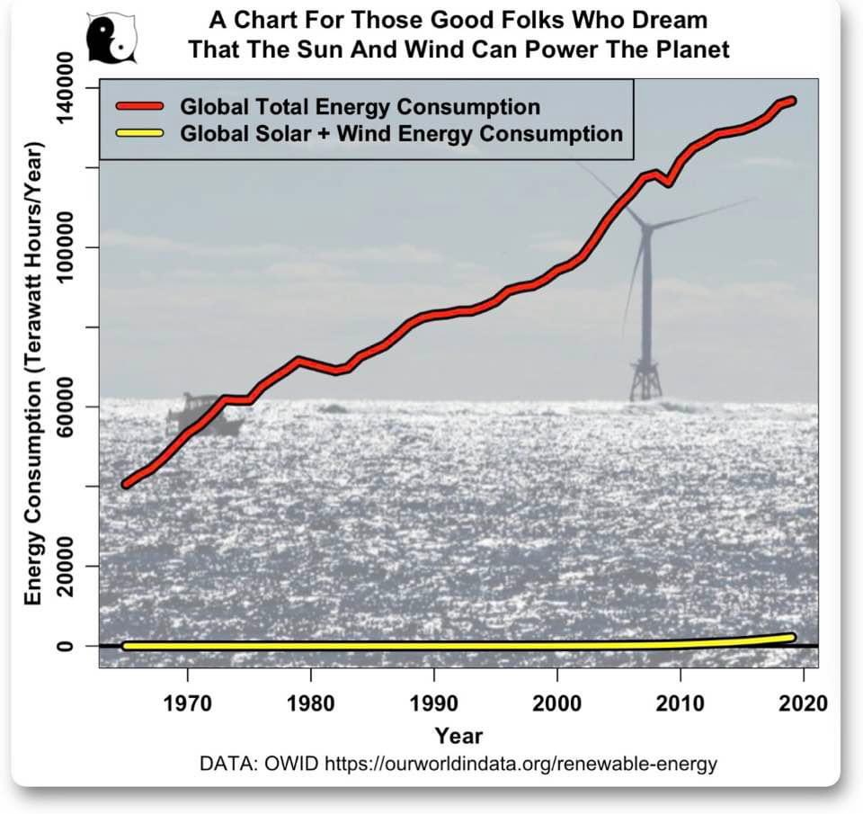
Green Energy Is Pol Pot Madness
TL;DR – Even if there was a “climate emergency” (which there is not, see above), and even if “green energy” worked (which it does not, see graph), and even if green energy could “save the environment” (which it absolutely does the opposite, due to energy density fundamentals), what we are doing by forcing a sudden transition to a non-working energy infrastructure, is so utterly preposterous, wrong, and irrational, that it must be stopped.
This graph is the smoking gun of an intentional civilizational crash. It is our duty to grab the steering wheel and stop it.
This graph is probably the simplest to explain because it does not depend on the truth or falsehood of the underlying bad science that has been used to justify what is being done now.
There are some things you just don’t do.
It’s like an insane person coming into your house screaming “DANGER, DANGER” and pointing a gun at you. Even if there is some reason, it doesn’t matter – an insane person is pointing a gun at you, and THAT is the immediate danger. The evil person or people who SENT the insane person to your house must be dealt with, too, or this will keep happening. But that can happen after we survive the insane attack.
Humanity is being “swatted” by people made insane by – you guessed it – mass formation psychosis.
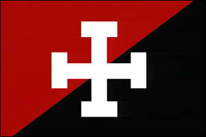
TL;DR – One cannot move humanity from the top curve in red, to the bottom curve in yellow, without killing most of them. It’s impossible. It means poverty, chaos, and destruction. The closest thing to what “somebody” is forcing on the West, is what China and the CIA did the the people of Cambodia, using the highly deluded Khmer Rouge, who insisted that all Cambodians had to leave cities and become agrarian.
Khmer Rouge Flag (Pol Pot)
Forcing humanity to “quit realistic energy now” is perfectly analogous to Pol Pot saying “We all have to become farmers now” at gunpoint, which killed millions of Cambodians in a horror of totalitarian brutality and systematic societal error.
If you don’t think we have a deluded set of Americans who could carry this out, just look at Antifa, filled with mentally ill “trans” males, all of them “politically fluid” and ready to serve the craziest causes, and then politically reverse on orders, the very next day. Antifa is being protected by the DOJ and FBI, which are also ready to stop or hinder any groups which oppose Antifa.
Now you can understand why Antifa and FBI helped each other on January Sixth.
They’re both on the same side – the side of the genocide.
And now Biden wants 87,000 federal “IRS Police”?
What this graph shows is the equivalent of telling a patient addicted to barbiturates that they must quit cold turkey, which is always fatal.
It’s like telling a lifelong juvenile diabetic that they must quit insulin NOW because insulin didn’t come from their own pancreas, and so it’s “foreign”, and no good. They must transition to “mRNA injections in the pancreas” right now! RIGHT NOW!!!
Yup. It is THAT insane – that malevolent – to say “quit all non-green energy now”. To even say “do it in the next century” is foolishness of historic proportions.
We are already seeing the effects of the insanity in the beginning energy problems we are having now. But we have seen NOTHING yet.
Add to THAT insanity, what amounts to yet another foolish collectivization of agriculture, which “error” of communism has repeatedly killed millions, in the Soviet Union and China, as well as in Cambodia, and you can see that the errors of a misled scientific elite are always catastrophic, whether intentional or accidental.
TL;DR – Eisenhower predicted that, in addition to the military industrial complex (MIC), a scientific and technological elite (STE) would become a danger to America and the world, and he even understood and predicted that this very moment might arrive.
If you have time (16 minutes), this presentation is critical to understanding the moment. Every second is worth hearing.
If you get the sense that somebody of malevolent intent was listening to Eisenhower’s speech, and began figuring out how to sabotage his vision of balance and sense, by pursuing a course to enhance and take advantage of precisely the dangers that Eisenhower warned about, then you are not alone.
Three days from now, after half a century in the service of our country, I shall lay down the responsibilities of office as, in traditional and solemn ceremony, the authority of the Presidency is vested in my successor.
This evening I come to you with a message of leave-taking and farewell, and to share a few final thoughts with you, my countrymen.
Like every other citizen, I wish the new President, and all who will labor with him, Godspeed. I pray that the coming years will be blessed with peace and prosperity for all.
Our people expect their President and the Congress to find essential agreement on issues of great moment, the wise resolution of which will better shape the future of the Nation.
My own relations with the Congress, which began on a remote and tenuous basis when, long ago, a member of the Senate appointed me to West Point, have since ranged to the intimate during the war and immediate post-war period, and, finally, to the mutually interdependent during these past eight years.
In this final relationship, the Congress and the Administration have, on most vital issues, cooperated well, to serve the national good rather than mere partisanship, and so have assured that the business of the Nation should go forward. So, my official relationship with the Congress ends in a feeling, on my part, of gratitude that we have been able to do so much together.
******
We now stand ten years past the midpoint of a century that has witnessed four major wars among great nations. Three of these involved our own country. Despite these holocausts America is today the strongest, the most influential and most productive nation in the world. Understandably proud of this pre-eminence, we yet realize that America’s leadership and prestige depend, not merely upon our unmatched material progress, riches and military strength, but on how we use our power in the interests of world peace and human betterment.
******
Throughout America’s adventure in free government, our basic purposes have been to keep the peace; to foster progress in human achievement, and to enhance liberty, dignity and integrity among people and among nations. To strive for less would be unworthy of a free and religious people. Any failure traceable to arrogance, or our lack of comprehension or readiness to sacrifice would inflict upon us grievous hurt both at home and abroad.
Progress toward these noble goals is persistently threatened by the conflict now engulfing the world. It commands our whole attention, absorbs our very beings. We face a hostile ideology-global in scope, atheistic in character, ruthless in purpose, and insidious in method. Unhappily the danger it poses promises to be of indefinite duration. To meet it successfully, there is called for, not so much the emotional and transitory sacrifices of crisis, but rather those which enable us to carry forward steadily, surely, and without complaint the burdens of a prolonged and complex struggle-with liberty at stake. Only thus shall we remain, despite every provocation, on our charted course toward permanent peace and human betterment.
Crises there will continue to be. In meeting them, whether foreign or domestic, great or small, there is a recurring temptation to feel that some spectacular and costly action could become the miraculous solution to all current difficulties. A huge increase in newer elements of our defense; development of unrealistic programs to cure every ill in agriculture; a dramatic expansion in basic and applied research-these and many other possibilities, each possibly promising in itself, may be suggested as the only way to the road we which to travel.
But each proposal must be weighed in the light of a broader consideration: the need to maintain balance in and among national programs-balance between the private and the public economy, balance between cost and hoped for advantage-balance between the clearly necessary and the comfortably desirable; balance between our essential requirements as a nation and the duties imposed by the nation upon the individual; balance between action of the moment and the national welfare of the future. Good judgment seeks balance and progress; lack of it eventually finds imbalance and frustration.
The record of many decades stands as proof that our people and their government have, in the main, understood these truths and have responded to them well, in the face of stress and threat. But threats, new in kind or degree, constantly arise. I mention two only.
******
A vital element in keeping the peace is our military establishment. Our arms must be mighty, ready for instant action, so that no potential aggressor may be tempted to risk his own destruction.
Our military organization today bears little relation to that known by any of my predecessors in peace time, or indeed by the fighting men of World War II or Korea.
Until the latest of our world conflicts, the United States had no armaments industry. American makers of plowshares could, with time and as required, make swords as well. But now we can no longer risk emergency improvisation of national defense; we have been compelled to create a permanent armaments industry of vast proportions. Added to this, three and a half million men and women are directly engaged in the defense establishment. We annually spend on military security more than the net income of all United State corporations.
This conjunction of an immense military establishment and a large arms industry is new in the American experience. The total influence-economic, political, even spiritual-is felt in every city, every state house, every office of the Federal government. We recognize the imperative need for this development. Yet we must not fail to comprehend its grave implications. Our toil, resources and livelihood are all involved; so is the very structure of our society.
In the councils of government, we must guard against the acquisition of unwarranted influence, whether sought or unsought, by the military-industrial complex. The potential for the disastrous rise of misplaced power exists and will persist.
We must never let the weight of this combination endanger our liberties or democratic processes. We should take nothing for granted only an alert and knowledgeable citizenry can compel the proper meshing of huge industrial and military machinery of defense with our peaceful methods and goals, so that security and liberty may prosper together.
Akin to, and largely responsible for the sweeping changes in our industrial-military posture, has been the technological revolution during recent decades.
In this revolution, research has become central; it also becomes more formalized, complex, and costly. A steadily increasing share is conducted for, by, or at the direction of, the Federal government.
Today, the solitary inventor, tinkering in his shop, has been over shadowed by task forces of scientists in laboratories and testing fields. In the same fashion, the free university, historically the fountainhead of free ideas and scientific discovery, has experienced a revolution in the conduct of research. Partly because of the huge costs involved, a government contract becomes virtually a substitute for intellectual curiosity. For every old blackboard there are now hundreds of new electronic computers.
The prospect of domination of the nation’s scholars by Federal employment, project allocations, and the power of money is ever present and is gravely to be regarded.
Yet, in holding scientific research and discovery in respect, as we should, we must also be alert to the equal and opposite danger that public policy could itself become the captive of a scientific-technological elite.
It is the task of statesmanship to mold, to balance, and to integrate these and other forces, new and old, within the principles of our democratic system-ever aiming toward the supreme goals of our free society.
******
Another factor in maintaining balance involves the element of time. As we peer into society’s future, we-you and I, and our government-must avoid the impulse to live only for today, plundering, for our own ease and convenience, the precious resources of tomorrow. We cannot mortgage the material assets of our grandchildren without risking the loss also of their political and spiritual heritage. We want democracy to survive for all generations to come, not to become the insolvent phantom of tomorrow.
******
Down the long lane of the history yet to be written America knows that this world of ours, ever growing smaller, must avoid becoming a community of dreadful fear and hate, and be, instead, a proud confederation of mutual trust and respect.
Such a confederation must be one of equals. The weakest must come to the conference table with the same confidence as do we, protected as we are by our moral, economic, and military strength. That table, though scarred by many past frustrations, cannot be abandoned for the certain agony of the battlefield.
Disarmament, with mutual honor and confidence, is a continuing imperative. Together we must learn how to compose difference, not with arms, but with intellect and decent purpose. Because this need is so sharp and apparent I confess that I lay down my official responsibilities in this field with a definite sense of disappointment. As one who has witnessed the horror and the lingering sadness of war-as one who knows that another war could utterly destroy this civilization which has been so slowly and painfully built over thousands of years-I wish I could say tonight that a lasting peace is in sight.
Happily, I can say that war has been avoided. Steady progress toward our ultimate goal has been made. But, so much remains to be done. As a private citizen, I shall never cease to do what little I can to help the world advance along that road.
******
So-in this my last good night to you as your President-I thank you for the many opportunities you have given me for public service in war and peace. I trust that in that service you find somethings worthy; as for the rest of it, I know you will find ways to improve performance in the future.
You and I-my fellow citizens-need to be strong in our faith that all nations, under God, will reach the goal of peace with justice. May we be ever unswerving in devotion to principle, confident but humble with power, diligent in pursuit of the Nation’s great goals.
To all the peoples of the world, I once more give expression to America’s prayerful and continuing inspiration:
We pray that peoples of all faiths, all races, all nations, may have their great human needs satisfied; that those now denied opportunity shall come to enjoy it to the full; that all who yearn for freedom may experience its spiritual blessings; that those who have freedom will understand, also, its heavy responsibilities; that all who are insensitive to the needs of others will learn charity; that the scourges of poverty, disease and ignorance will be made to disappear from the earth, and that, in the goodness of time, all peoples will come to live together in a peace guaranteed by the binding force of mutual respect and love.
Final Musical Selection
(Dedicated to Trump’s friend Shinzo Abe.)
President Trump & Melania share traditional Japanese dinner with Prime Minister Abe & wife.


:max_bytes(150000):strip_icc()/GettyImages-724237133-5b3e87c1c9e77c00379498da.jpg)